AUTOSTOR – Pre-owned cars retail
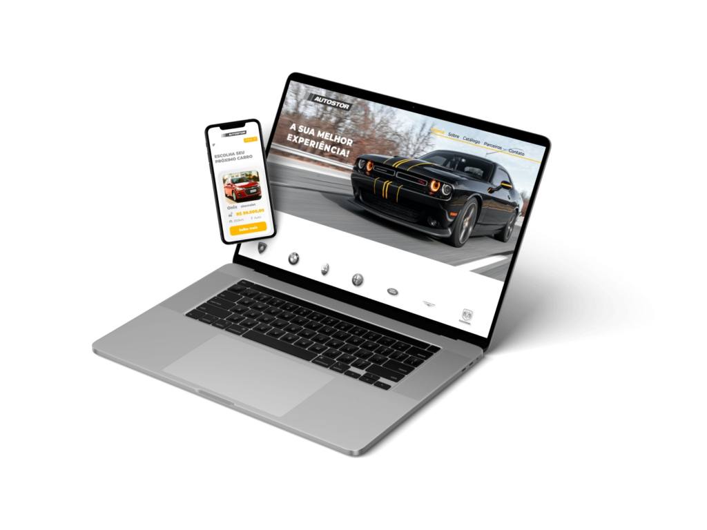
REDESIGN WEBDESIGN AND MOBILE
Aug 2021
– UX/UI Designer
– User Research
– Interaction
– Visual Design
In this case, I was responsible for redesigning and building a new mobile-friendly website, improving the website reading with better colours, font sizes, typography and new features, allowing the customer a better experience while choosing easy a new car.
ABOUT AUTOSTOR
Autostor is pre-owned car retail founded in 2021 with youth energy roots. Even if the company is new, the crew has a huge background, and they can combine quality and know-how, impacting the customer experience at a high level.
PROBLEM
In the first kick-off meeting was shoed to me that the client needs are only to change the website and turning into a friendly mobile and responsive across devices.
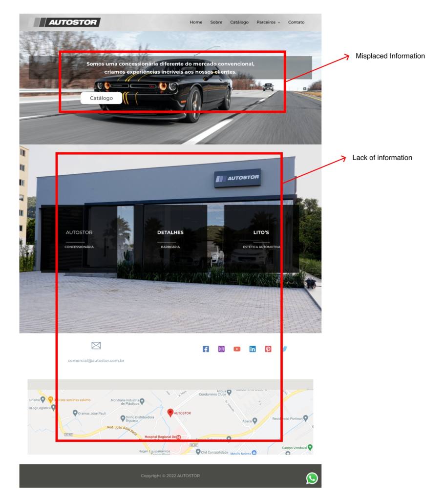
The website already has some features, but the information seems to be misplaced with a button on the hero section to lead the user to the catalogue page and a big phrase containing the company’s mission.
As soon as I started the research, I found that the problem went deeper. The users complain about the lack of information they do not have on the first screen.
SOLUTION
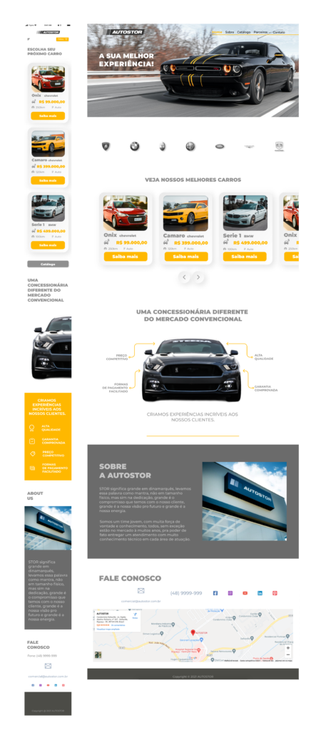
I created a new carrousel section with the best offers, special sales, and most popular cars to guide customers to find cars faster and easier without clicking anything.
I designed a car feature that shows all the benefits like best price, warranty when the customer buys.
I added the “about us” section with brief information about the company and what the customers can expect.
Maintaining the hierarchy, I have put the title “get in touch” at the end of the website.
USABILITY TEST
Fourteen different users made the design testing using the mobile and desktop guerilla testing method. In general, the users felt more trusted and comfortable while shopping.
Another thing appeared when a couple of them asked for a button to lead directly from the main screen to the catalogue menu. This feature will appear on the final design.
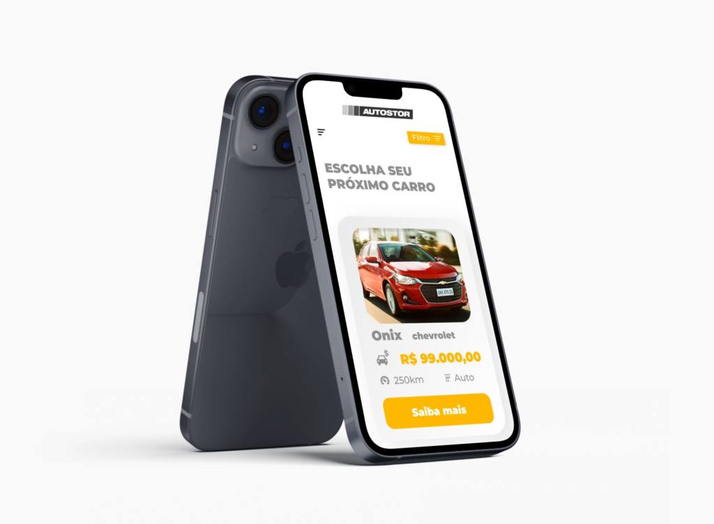
After choosing a car, there’s a message added asking the customer to book a test drive. That message increased the user’s trust even more.
FINAL DESIGN
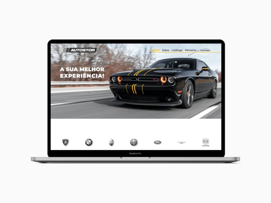
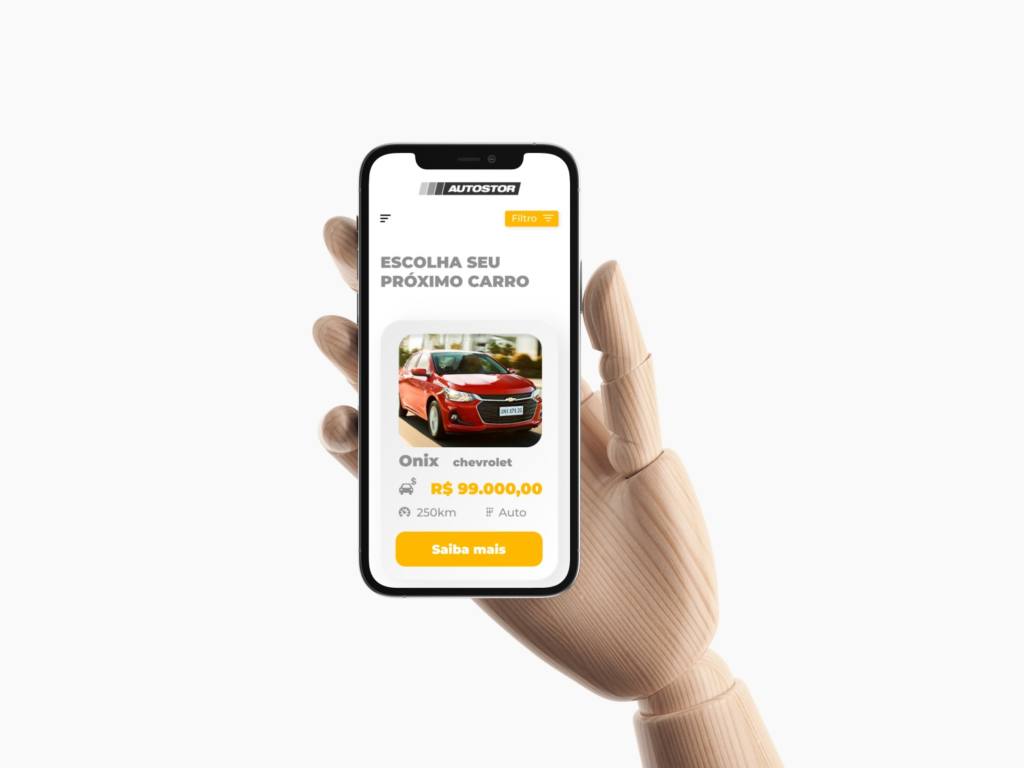
REFLECTION
Is everything ok?
Sometimes when we are solving problems, there are specific thoughts that we have to avoid, but it is ok if the scope of the project changes a little bit. In part of the discovery process, we usually find some issues that we can’t have noticed before and, during the usability test with users, we also can find new ways to do a better design. All we have to do is keep the eyes and ears open to these news manners.
Teamwork
In this case, I was working all by myself and anger to think out-of-the-box. But, the designer rarely works all alone and may have some help from stakeholders and the users during the research and usability test. That could be an excellent opportunity to work with different visions and thoughts to ensure new ideas and possibilities.
How to make better design decisions?
There’s only one word that comes to mind: communication. Having excellent communication with everyone involved in the project is the core of a successful design. All designers should have a great eye to the aesthetical details yet listen to what everyone says and extract the best ideas to improve the final project.